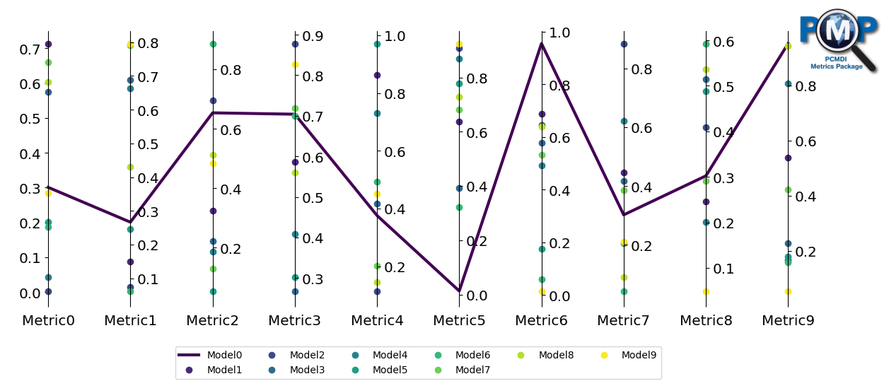
pcmdi_metrics.graphics.parallel_coordinate_plot
- pcmdi_metrics.graphics.parallel_coordinate_plot(data, metric_names, model_names, models_to_highlight=[], models_to_highlight_by_line=True, models_to_highlight_colors=None, models_to_highlight_labels=None, models_to_highlight_markers=['s', 'o', '^', '*'], models_to_highlight_markers_size=10, fig=None, ax=None, figsize=(15, 5), show_boxplot=False, show_violin=False, violin_colors=('lightgrey', 'pink'), violin_label=None, title=None, identify_all_models=True, xtick_labelsize=None, ytick_labelsize=None, colormap='viridis', num_color=20, legend_off=False, legend_ncol=6, legend_bbox_to_anchor=(0.5, -0.14), legend_loc='upper center', legend_fontsize=10, logo_rect=None, logo_off=False, model_names2=None, group1_name='group1', group2_name='group2', comparing_models=None, fill_between_lines=False, fill_between_lines_colors=('red', 'green'), arrow_between_lines=False, arrow_between_lines_colors=('red', 'green'), arrow_alpha=1, arrow_width=0.05, arrow_linewidth=0, arrow_head_width=0.15, arrow_head_length=0.15, vertical_center=None, vertical_center_line=False, vertical_center_line_label=None, ymax=None, ymin=None, debug=False)[source]
Create a parallel coordinate plot for visualizing multi-dimensional data.

- Parameters:
data (
ndarray) – 2-d numpy array for metrics.metric_names (
list) – Names of metrics for individual vertical axes (axis=1).model_names (
list) – Name of models for markers/lines (axis=0).models_to_highlight (
list, optional) – List of models to highlight as lines or markers.models_to_highlight_by_line (
bool, optional) – If True, highlight as lines. If False, highlight as markers. Default is True.models_to_highlight_colors (
list, optional) – List of colors for models to highlight as lines.models_to_highlight_labels (
list, optional) – List of string labels for models to highlight as lines.models_to_highlight_markers (
list, optional) – Matplotlib markers for models to highlight if as marker. Default is [“s”, “o”, “^”, “*”].models_to_highlight_markers_size (
float, optional) – Size of matplotlib markers for models to highlight if as marker. Default is 10.fig (
matplotlib.figure.Figure, optional) – Figure instance to which the parallel coordinate plot is plotted.ax (
matplotlib.axes.Axes, optional) – Axes instance to which the parallel coordinate plot is plotted.figsize (
tuple, optional) – Figure size (width, height) in inches. Default is (15, 5).show_boxplot (
bool, optional) – If True, show box and whiskers plot. Default is False.show_violin (
bool, optional) – If True, show violin plot. Default is False.violin_colors (
tupleorlist, optional) – Two strings for colors of violin. Default is (“lightgrey”, “pink”).violin_label (
str, optional) – Label for the violin plot when not split. Default is None.title (
str, optional) – Plot title.identify_all_models (
bool, optional) – If True, show and identify all models using markers. Default is True.xtick_labelsize (
intorstr, optional) – Fontsize for x-axis tick labels.ytick_labelsize (
intorstr, optional) – Fontsize for y-axis tick labels.colormap (
str, optional) – Matplotlib colormap. Default is ‘viridis’.num_color (
int, optional) – Number of colors to use. Default is 20.legend_off (
bool, optional) – If True, turn off legend. Default is False.legend_ncol (
int, optional) – Number of columns for legend text. Default is 6.legend_bbox_to_anchor (
tuple, optional) – Set legend box location. Default is (0.5, -0.14).legend_loc (
str, optional) – Set legend box location. Default is “upper center”.legend_fontsize (
float, optional) – Legend font size. Default is 10.logo_rect (
sequenceoffloat, optional) – The dimensions [left, bottom, width, height] of the new Axes for logo.logo_off (
bool, optional) – If True, turn off PMP logo. Default is False.model_names2 (
listofstr, optional) – Should be a subset of model_names. If given, violin plot will be split into 2 groups.group1_name (
str, optional) – Name for the first group in split violin plot. Default is ‘group1’.group2_name (
str, optional) – Name for the second group in split violin plot. Default is ‘group2’.comparing_models (
tupleorlist, optional) – Two strings for models to compare with colors filled between the two lines.fill_between_lines (
bool, optional) – If True, fill color between lines for models in comparing_models. Default is False.fill_between_lines_colors (
tupleorlist, optional) – Two strings of colors for filled between the two lines. Default is (‘red’, ‘green’).arrow_between_lines (
bool, optional) – If True, place arrows between two lines for models in comparing_models. Default is False.arrow_between_lines_colors (
tupleorlist, optional) – Two strings of colors for arrow between the two lines. Default is (‘red’, ‘green’).arrow_alpha (
float, optional) – Transparency of arrow (fraction between 0 to 1). Default is 1.arrow_width (
float, optional) – Width of arrow. Default is 0.05.arrow_linewidth (
float, optional) – Width of arrow edge line. Default is 0.arrow_head_width (
float, optional) – Width of arrow head. Default is 0.15.arrow_head_length (
float, optional) – Length of arrow head. Default is 0.15.vertical_center (
strorfloatorint, optional) – Adjust range of vertical axis to set center of vertical axis as median, mean, or given number.vertical_center_line (
bool, optional) – If True, show median as line. Default is False.vertical_center_line_label (
str, optional) – Label in legend for the horizontal vertical center line. If not given, it will be automatically assigned.ymax (
intorfloatorstr, optional) – Specify value of vertical axis top. If ‘percentile’, 95th percentile or extended for top.ymin (
intorfloatorstr, optional) – Specify value of vertical axis bottom. If ‘percentile’, 5th percentile or extended for bottom.debug (
bool, optional) – If True, print debug information. Default is False.
- Returns:
fig (
matplotlib.figure.Figure) – The figure component of the plot.ax (
matplotlib.axes.Axes) – The axes component of the plot.
Notes
This function creates a parallel coordinate plot for visualizing multi-dimensional data. It supports various customization options including highlighting specific models, adding violin plots, and comparing models with filled areas or arrows.
The function uses matplotlib for plotting and can integrate with existing figure and axes objects.
Author: Jiwoo Lee @ LLNL (2021. 7)
Update history:
2021-07 Plotting code created. Inspired by https://stackoverflow.com/questions/8230638/parallel-coordinates-plot-in-matplotlib
2022-09 violin plots added
2023-03 median centered option added
2023-04 vertical center option diversified (median, mean, or given number)
2024-03 parameter added for violin plot label
2024-04 parameters added for arrow and option added for ymax/ymin setting
2024-11 docstring cleaned up
Examples
>>> from pcmdi_metrics.graphics import parallel_coordinate_plot
>>> import numpy as np
>>> data = np.random.rand(10, 10)
>>> metric_names = ['Metric' + str(i) for i in range(10)]
>>> model_names = ['Model' + str(i) for i in range(10)]
>>> fig, ax = parallel_coordinate_plot(data, metric_names, model_names, models_to_highlight=model_names[0])

Further examples can be found here.