pcmdi_metrics.graphics.TaylorDiagram
- pcmdi_metrics.graphics.TaylorDiagram(stddev, corrcoef, refstd, fig=None, rect=111, title=None, titleprops_dict={}, colors=None, cmap=None, normalize=False, labels=None, markers=None, markersizes=None, closed_marker=True, markercloses=None, zorders=None, ref_label=None, smax=None, compare_models=None, arrowprops_dict=None, annotate_text=None, radial_axis_title=None, angular_axis_title='Correlation', grid=True, debug=False)[source]
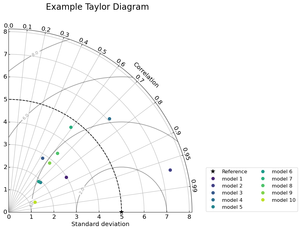
Create a Taylor diagram.

- Parameters:
stddev (
numpy.ndarray) – an array of standard deviationscorrcoef (
numpy.ndarray) – an array of correlation coefficientsrefstd (
float) – the reference standard deviationfig (
matplotlib figure, optional) – the matplotlib figurerect (
a 3-digit integer, optional) – ax subplot rect, , default is 111, which indicate the figure has 1 row, 1 column, and this plot is the first plot. https://matplotlib.org/stable/api/_as_gen/matplotlib.pyplot.subplot.html https://matplotlib.org/stable/api/figure_api.html#matplotlib.figure.Figure.add_subplottitle (
string, optional) – title for the plottitleprops_dict (
dict, optional) – title property dict (e.g., fontsize)cmap (
string, optional) – a name of matplotlib colormap https://matplotlib.org/stable/gallery/color/colormap_reference.htmlcolors (
array, optional) – an array or list of colors for each element of the input arrays if colors is given, it will override cmapnormalize (
bool, optional) – disable to skip normalization of the standard deviation default is Falselabels (
list, optional) – list of text for labelsmarkers (
list, optional) – list of marker typemarkersizes (
list, optional) – list of integer for marker sizeclosed_marker (
bool, optional) – closed marker or opened marker default - Truemarkercloses (
listofbool, optional) – When closed_marker is False but you still want to have a few closed markers among opened markers, provide list of True (close) or False (open) default - Nonezorders (
list, optional) – list of integer for zorderref_label (
str, optional) – label for reference datasmax (
intorfloat, optional) – maximum of axis range for (normalized) standard deviationcompare_models (
listoftuples, optional) – list of pair of two models to compare by showing arrowsarrowprops_dict (
dict, optional) – dict for matplotlib annotation arrowprops for compare_models arrow See https://matplotlib.org/stable/tutorials/text/annotations.html for detailsannotate_text (
string, optional) – text to place at the begining of the comparing arrowradial_axis_title (
string, optional) – axis title for radial axis default - Standard deviation (when normalize=False) or Normalized standard deviation (when normalize=True)angular_axis_title (
string, optional) – axis title for angular axis default - Correlationgrid (
bool, optional) – grid line in plot default - Truedebug (
bool, optional) – default - False if true print some interim results for debugging purpose
- Returns:
fig (
matplotlib figure) – the matplotlib figureax (
matplotlib axis) – the matplotlib axis
Notes
This code was adpated from the ILAMB code that was written by Nathan Collier (ORNL) (https://github.com/rubisco-sfa/ILAMB/blob/6780ef0824a8a245ae60e518d5b5fc25f970f3d6/src/ILAMB/Post.py#L101) and revised by Jiwoo Lee (LLNL) to add capabilities and enable additional customizations for implementation into PCMDI Metrics Package (PMP). The original code was written by Yannick Copin (https://gist.github.com/ycopin/3342888).
Reference for Taylor Diagram: Taylor, K. E. (2001), Summarizing multiple aspects of model performance in a single diagram, J. Geophys. Res., 106(D7), 7183–7192, http://dx.doi.org/10.1029/2000JD900719
Author: Jiwoo Lee (PCMDI LLNL)
Update history:
2022-03 First implemented
2024-11 Docstring cleaned up
Examples
>>> import numpy as np
>>> import matplotlib.pyplot as plt
>>> from pcmdi_metrics.graphics import TaylorDiagram
>>>
>>> stddev = np.random.uniform(low=1, high=10, size=(10,))  # Generate 10 random numbers between 1 and 10
>>> corrcoeff = np.random.uniform(low=0.5, high=1, size=(10,))  # Generate 10 random numbers between 0.5 and 1
>>> refstd = 5
>>> models = ['model '+str(i) for i in range(1,11)]
>>>
>>> fig = plt.figure(figsize=(5,5))
>>>
>>> fig, ax = TaylorDiagram(stddev, corrcoeff, refstd,
                    fig=fig,
                    labels=models,
                    ref_label='Reference'
                   )
>>>
>>> ax.legend(bbox_to_anchor=(1.05, 0), loc='lower left', ncol=2)
>>> fig.suptitle('Example Taylor Diagram', fontsize=20)

Further examples can be found here.