ESMBenchmarkViz.taylor_diagram
- ESMBenchmarkViz.taylor_diagram(std_devs, correlations, names, refstd, title='Interactive Taylor Diagram', normalize=False, step=0.2, show_reference=True, reference_name='Reference', reference_image=None, colormap='Spectral', width=600, show_plot=True, images=None, bokeh_logo=True, debug=False)[source]
Creates an interactive Taylor diagram using Bokeh.
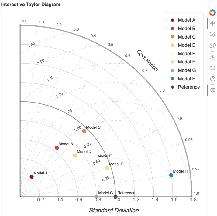
The Taylor diagram visually represents the relationship between the standard deviation and correlation of different models against a reference model. This function allows for the comparison of multiple models based on their standard deviations and correlations to a specified reference standard deviation.
- Parameters:
std_devs (
listornp.ndarray) – A list of standard deviations of the models being compared.correlations (
listornp.ndarray) – A list of correlation coefficients of the models with respect to the reference model.names (
listofstr) – A list of names for the models being compared, used for labeling in the plot.refstd (
float) – The standard deviation of the reference model, used for calculating RMSE and for normalization if applicable.title (
str, optional) – The title of the plot (default is “Interactive Taylor Diagram”).normalize (
bool, optional) – If True, the standard deviations are normalized by the reference standard deviation (default is False).step (
float, optional) – The step size for the arcs and grid lines in the Taylor diagram (default is 0.2).show_reference (
bool, optional) – If True, the reference point is shown in the Taylor diagram (default is True).reference_name (
str, optional) – The name of the reference dataset (default is “Reference”).reference_image (
str, optional) – The path to an image file to be used as the reference image (default is None).colormap (
strorlist, optional) – A name of the Matplotlib or list of colors to use for the model points. Available names of Matplotlib colormap can be found here. Default is Spectral.width (
int, optional) – The width of the plot in pixels (default is 600). Note that height will be set to equal as width for a Taylor Diagram. If images is provided, 2 times of the given width is going to be total width to show diagnostic image display panel on the right of the Taylor Diagram.show_plot (
bool, optional) – If True, the plot will be displayed in the workflow (default is True).images (
str, optional) – A list of image paths to be displayed on the plot. The images will be placed at the data points of the models.bokeh_logo (
bool, optional) – If True, displays the Bokeh logo in the plot. Default is True.debug (
bool, optional) – If True, prints additional debugging information (default is False).
- Returns:
bokeh.plotting.Figure– Bokeh figure object containing the interactive Taylor diagram.
Example
>>> from ESMBenchmarkViz import taylor_diagram
>>> std_devs = [0.8, 1.0, 1.2]  # Standard deviations of models
>>> correlations = [0.9, 0.85, 0.7]  # Correlation coefficients
>>> names = ["Model A", "Model B", "Model C"]  # Names of models
>>> refstd = 1.0  # Standard deviation of reference model
>>> taylor_diagram(std_devs, correlations, names, refstd)
Example use case can be found here.
Note
A Taylor diagram is a polar plot used to compare multiple models against a reference. It displays each model’s standard deviation as the radial distance and correlation coefficient as the azimuthal angle, with the reference standard deviation as the baseline. The RMSE is represented by the distance between a model point and the reference point, making it easy to assess how closely each model matches the reference in terms of variability and correlation.
One major advantage of the Taylor diagram is that it summarizes several key statistics in a single view, so differences among models can be compared quickly and clearly. This is especially useful for Earth system model evaluation, intercomparison, and benchmarking, because it helps identify which models best reproduce observed variability, which ones have the strongest agreement with reference data, and how performance changes across different simulations or variables.
Reference: Taylor, K. E. (2001), Summarizing multiple aspects of model performance in a single diagram, J. Geophys. Res., 106(D7), 7183–7192, https://doi.org/10.1029/2000JD900719
2024-10-04: Jiwoo Lee, initial version