Interactive Taylor Diagram
A Taylor diagram is a polar plot used to compare multiple models against a reference. It displays each model’s standard deviation as the radial distance and correlation coefficient as the azimuthal angle, with the reference standard deviation as the baseline. The RMSE is represented by the distance between a model point and the reference point, making it easy to assess how closely each model matches the reference in terms of variability and correlation.
One major advantage of the Taylor diagram is that it summarizes several key statistics in a single view, so differences among models can be compared quickly and clearly. This is especially useful for Earth system model evaluation, intercomparison, and benchmarking, because it helps identify which models best reproduce observed variability, which ones have the strongest agreement with reference data, and how performance changes across different simulations or variables.
Reference: Taylor, K. E. (2001), Summarizing multiple aspects of model performance in a single diagram, J. Geophys. Res., 106(D7), 7183–7192, doi:10.1029/2000JD900719.
This notebook shows usage examples of interactive Taylor Diagram. Detailed API description can be found here.
Import functions
[1]:
from bokeh.plotting import output_file, save, output_notebook
from ESMBenchmarkViz import taylor_diagram
[2]:
# Enable Bokeh output in the notebook
output_notebook()
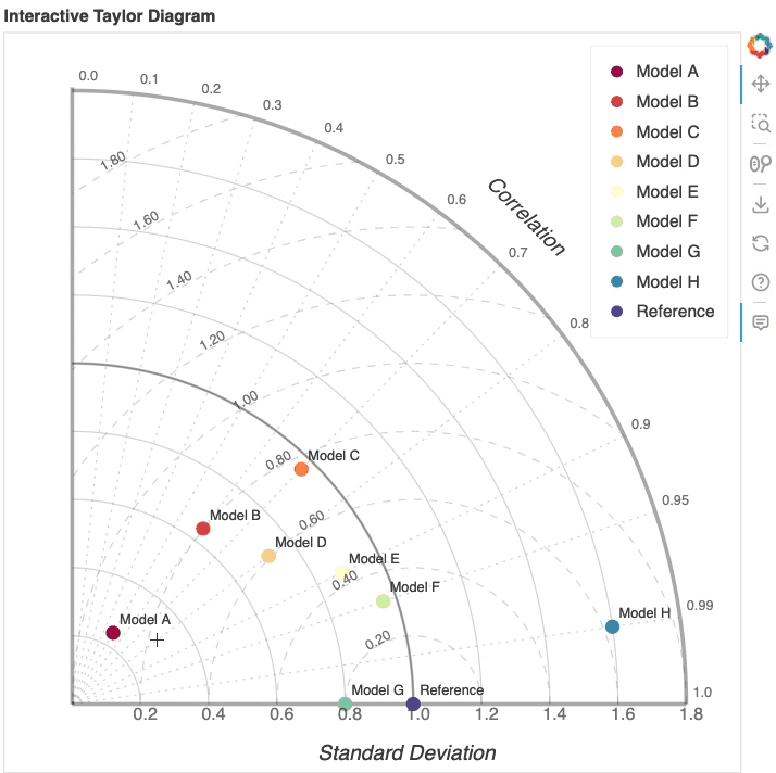
1: Basic usage
Example 1 show basic usage of the function.
[3]:
# Sample data
std_devs = [0.3, 0.8, 1.2, 0.9, 1.1, 1.2, 1, 2]
correlations = [0.5, 0.6, 0.7, 0.8, 0.9, 0.95, 1, 0.99]
names = ['Model A', 'Model B', 'Model C', 'Model D', 'Model E', 'Model F', 'Model G', 'Model H']
refstd = 1.25

# Figure settings
normalize = True  # Set Trur or False
step = 0.2

# Plot
p = taylor_diagram(std_devs, correlations, names, refstd, normalize=normalize, step=step)
2: More models with bigger figure size
Example 2 exapands to include more models in the plot.
[4]:
std_devs = [0.3, 0.8, 1.2, 0.9, 1.1, 1.2, 1, 2, 1.3, 1.8, 2.2, 1.9, 2.1, 2.2, 2, 3]
correlations = [0.5, 0.6, 0.7, 0.8, 0.9, 0.95, 1, 0.99, 0.5, 0.6, 0.7, 0.8, 0.9, 0.95, 1, 0.99]
names = ['Model A', 'Model B', 'Model C', 'Model D', 'Model E', 'Model F', 'Model G', 'Model H', 'Model I', 'Model J', 'Model K', 'Model L', 'Model M', 'Model N', 'Model O', 'Model P']

refstd = 1.25
p = taylor_diagram(std_devs, correlations, names, refstd, normalize=normalize, step=step, colormap='magma_r', width=800)
3: Custom colors
Example 3 uses custom colors for data points.
[5]:
std_devs = [0.8, 1.0, 1.2]  # Standard deviations of models
correlations = [0.9, 0.85, 0.7]  # Correlation coefficients
names = ["Model A", "Model B", "Model C"]  # Names of models
refstd = 1.0  # Standard deviation of reference model
colormap = ["red", "green", "blue"]  # Colors of models

taylor_diagram(std_devs, correlations, names, refstd, colormap=colormap)
[5]:
4: Show diagnostic figures
Example 4 expands example 3 and generates an interactive Taylor Diagram where each data point is accompanied by a diagnostic figure that can be clicked on for more details.
[6]:
std_devs = [0.8, 1.0, 1.2]  # Standard deviations of models
correlations = [0.9, 0.85, 0.7]  # Correlation coefficients
names = ["Model A", "Model B", "Model C"]  # Names of models
refstd = 1.0  # Standard deviation of reference model
colormap = ["red", "green", "blue"]  # Colors of models
images = [
        'images/image1.jpg',
        'images/image2.jpg',
        'images/image3.jpg',
    ]

p = taylor_diagram(std_devs, correlations, names, refstd, colormap=colormap, images=images, width=500)
Save the plot
[7]:
# set output to static HTML file
output_file(filename="interactive_taylor_diagram.html", title="Interactive Taylor Diagram")

# save the results to a file
save(p)

# Result: [`interactive_taylor_diagram.html`](interactive_taylor_diagram.html)
[7]:
'/Users/lee1043/Documents/Research/git/ESMBenchmarkViz/docs/examples/interactive_taylor_diagram.html'